relief

Print Think 2016


Yesterday, I attended the Print Think 2016 Symposium at the Tyler School of Art at Temple University in Philadephia, PA. Hosted by the printmaking faculty; Hester Stinnet, Richard Hricko and Amze Emmons, it was a great day of print presentations, panels and demonstrations.

The Keynote speaker as Susan Tallman, Editor-in-Chief of Art in Print, who spoke about the relationship print has with connecting the local, but also spreading ideas further through the multiple by connecting the similarities of design and style of some mid-18th century American portraiture to the mezzotints of Sir Joshua Reynolds portraiture paintings in England. While also criticizing the idea of staying too local with artist CSAs and the small amount of stylistic change that has occurred in Norwegian until recently.

Tallman’s presentation was followed up by three short presentations and a panel discussion with artists and publishers; Jeffery Dell, Ryan Standfest of Rotland Press and Kristian Henson of The Office of Culture and Design. Each presenter discussed their own relationship with the local and cosmopolitan through trying to become engaged in either a local community or a community built around an idea, but then how that inital specific interest has spread through connections of interest, the internet, and exhibitions.

After lunch, the afternoon started with the “Demo Derby” in the Tyler printshop. A massive space divided up by incomplete walls for easy passage from one print area to the next. There were some small demos of chine colle, collograph, etc, and a vareity of local and regional print studios showing off their members works and promoting themselves for others to join.

The time at Tyler ended with a artist talk by Kate McQuillen who focused her talk about her latest installation, Night HouseNight House was part of the 2nd Terrain Biennial in 2015, organized by Terrain Exhibitions and Sabina Ott. For the project, Kate created a starry sky facade that would be attached to the house for a month. The facade’s specific connection with the night time created an interesting juxtaposition of interpretation depending on what time of day you experienced it and whether or not the occupants were home, i.e. lights on/off.

With the time at Tyler completed, the attendees were invited to make their away to The Print Center in the Rittenhouse Square area of Philadelphia. I declined because of incoming rain and wanting to get back home that day, a 2.5 hour drive without stops. But even without seeing the current print exhibitions, the day was a lot of fun and I look forward to attending again next year.

Intersecting Methods 2016: Cannot Stop Yet

And again, I bring you two more prints from the Intersecting Methods portfolio. Today, we reveal the editions of Amze Emmons and Jon Goebel. Click here for Amze’s bio post and click here for Jon’s.

Here is Amze’s statement about his print.

What It Provides or Furnishes/What it offers the Animal,” Screenprint, 18”x14” or 14”x18”, 2016

In their first collaboration, Dr. Jeremy Teissére and Amze Emmons delved into body- and subject-centered definitions of consciousness and perception. Emerging from close readings of two texts, Anecdote of the Jar by the poet Wallace Stevens and Theory of Affordances, a chapter excerpted from James J. Gibson’s The Ecological Approach to Visual Perception, the work captures the ‘aliveness of objects’ for the body.  Together they are interested in how objects act as silent symbols to guide the behavior of the body and orient one in a landscape.  Gibson’s interest in a more gestalt and direct philosophy of perception led to his coinage of ‘affordances’, or the properties of an object that implicitly tell a body how to use that object.  Thus, door handles, buttons, switches, cups, hammers, pencils, spoons have affordances that guide our actions and shape the many thousand unconscious micro-movements that we make to use them.  Likewise, in Stevens’ Anecdote of the Jar, objects loom larger than life, animated seemingly from their own ‘consciousness’ that we afford them, and in so doing, allow them to control and manipulate our movements through the worlds they co-construct.  Working from these documents our collaborators spent a great deal of time excitedly talking, drinking coffee, and making incomprehensible flow charts.

Since this was Teissére’s first printmaking collaboration, and Emmons’ first attempt to visualize a conversation on the nature of perception, the pair adopted several constraints to inform a non-linear call-and-response model of making the print. First, they wanted a print that would also model the ideas they were attempting to visualize. Second, they would work from several closed sets of source material. And lastly, in printing they would leverage color and transparency in an intuitive method for combining visual information. 

What It Provides or Furnishes

One side of the print depicts a ‘landscape’ of appropriated scientific illustrations of protein structures loosely drawn from Teissére’s laboratory research mapping the allopregnanolone (ALLO) and benzodiazepine binding sites on the gamma-aminobutyric acid Type A receptor (GABAR). This landscape is populated with pop-up buttons from children’s toys, labeled with text taken from Gibson’s writing on affordances. The landscape is a zany visualization of the ecological approach to perception with the component proteins of our brain’s neural network literally defining the nature of the environment, punctuated by annotated affordances. 

What it offers the Animal 

Another side of the print, a composite portrait looks out. Underlying is a participant in a Ganzfeld-effect experiment, in which a person’s eyes and ears are covered to block sensory stimulus.  Famously, in this experiment, the brain thus deprived of external sights and sounds, begins fabricating and filling in virtual sensory experience from the neural noise of perceptory absence.  Overlaid is another kind of portrait, a map of eye movements tracking a human face from an experiment by the Russian psychologist Alfred Yarbus in the early 20th century.  Out of the head explode electroencephalogram (EEG) traces taken from Teissére’s experiments in sensory perception, constructed into 3D paper models, and then photographed. 

By making a two sided print, the collaborators present the audience with a binary affordance (recto/verso) in two sorts of objects, a landscape and a portrait, requiring a decision and an interaction.
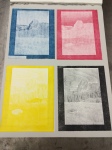
Jon wrote this statement for his print.

“Ephemeral Horizon,” Laser cut Plexiglas with hand engraved work, Printing: Relief, monotype, and intaglio, 18”x14”, 2016

This project was in collaboration with Dr. Neil Scott of the Makery (Hilo, HI). The initial project was to cut duplicate designs from multiple thicknesses of Plexiglas to create various levels suitable for color viscosity printing. The proofs were interesting, but not on par with my vision. I decided to engrave some of the pieces. The circles were stood on by myself and I spun around on one foot to create the drypoint texture on the pieces. They were additionally attached to a rotating base and engraved to get additional depth. Other pieces were inked like a monotype print, others relief rolled, and some wiped intaglio. There were many variations in this proofing process, but I am happy with the final color scheme. 

The title “Ephemeral Horizons” is purposefully ambiguous. The piece is inspired by Hawaiian landscape and the sky and embraces the notion that our thoughts, dreams, life, and the universe are all momentary things.

Next week will be the SGC International conference in Portland, OR. I will be there for one of the open portfolio sessions with all the prints from the Intersecting Methods 2014 and 2016 portfolio and some personal work. I will post in Instagram, Facebook, etc the session and location of my table when I receive that information this Wednesday.

Check in again next Sunday for two more prints.

The Big Reveal

Ta Da!

"_____" Collaboration with Stephen Lambert for the Intersecting Methods 2016 portfolio.

 Collaboration with Stephen Lambert for the Intersecting Methods 2016 portfolio.

I can finally reveal my collaboration with Stephen Lambert for the Intersecting Methods 2016 portfolio. Our print is a 15 layer print that utilizes CMYK laser engraving, pronto plate and screenprinting to depict the algorithms interpretation of the source images.

Okay, back story time. Once Stephen completed writing the algorithms we decided to use this print as an experiment in and of itself to expand further on the idea of our collaboration. The image in the top left hand corner is our control. We choose this image because it shows some depth of field and space while its main subject is a camera profile card that is used to make initial corrections to images from a photoshoot.

By choosing this control image, we calibrated the system of algorithms to create the optimal interpretation of the control image. Once we had the algorithms separating out the key information, secondary information and background information, we applied it to the other three images we choose to see how the algorithms would interpret and break down their information and as you can see above, it was quite different for each image.

Four blocks for IM 2016 CMYK first process.

Four blocks for IM 2016 CMYK first process.

So I started the process with the above blocks. They are the CMYK separation of each image. I printed them in order of magenta, yellow, cyan, black because after some tests in December I preferred that order to allow the greens to pop a bit more with the cyan on top of the yellow.

I printed the laser engraved blocks on to Kozo #8 Natural paper from Hiromi Paper because it would allow me to print all four images on single sheets with maximum size from the laser engraver and then easily chine colle them to BFK Rives paper for later layers. To have printed all four images in their final layout would have made me shrink the images slightly smaller and allow less detail to come out of the final print.

The final result produced great colors for each image and blended really well. After they dried, I applied them to Dura-Mount, an acid-free, archival double sided adhesive, and registered them to each backing sheet of BFK. Once in place, I created a pronto plate of the secondary layer by tracing over a print out of the information with sharpie. The pronto plate layer was printed in a translucent white ink to subdue and push back the information slightly without completely blocking it out.

IMG_1626

Print with four layers of laser engraving, pronto plate white and chine colle

Once the pronto plate was printed on each sheet. I prepared 10 digital files to create the 10 areas of screenprinted color to describe and block out what the program interpreted as background information.

Finally, with the completion of the 10 layers of screenprinting on top of the four layers of laser engraved woodcut and one layer of pronto plate, I tore down the backing sheets of BFK to the 14″x18″ size for the portfolio and spent a day curating the prints for the edition. In total out of 42 initial sheets, we have 26 prints for the edition and five artist proofs.

Stephen signing the edition

Stephen signing the edition

Stephen came over yesterday to sign the prints and with his signature we are done. I am still waiting on a print for the Intersecting Methods 2016 portfolio, but I will begin to post about each work I have received as I receive statements from the participants.

I will say that there are some quite amazing and unusual prints in this iteration of the portfolio. A few use some time tested traditional methods for production, but still get the essence of the collaboration, while others are beginning to really expand the idea of this collaboration and what a print can do. I look forward to sharing those with you very soon.

Semester Scramble

For the past two weeks, I have been going like crazy between receiving prints of the portfolio, trying to find time to complete my print and the semester starting.

Now for those of you who keep up with this blog, you may remember I had 4 courses last semester. This spring is not as bad, 2 printmaking and 1 drawing. Easier to handle, not as much prep needed because I am repeating some, but still quite a lot of work. So sad as it is to say, I have not completed my print for the edition yet.

I hope that by the time you all read this post I will be in the studio completing said print and will be able to post pictures of the process and talk about it a bit more, along with all the prints in the portfolio.

So, check back in soon and you will see the final product and some of the process shots for the creation of my print collaboration with Stephen Lambert.

Snowed In and Resting Up

For those who read this, but are not on the East Coast, we were hammered with around two feet of snow in the past 36 hours. It is one of the heavier snowfalls we have had in my life time, similar to the blizzard of 2003 when I had a week off of school. But, being snowed in was a good way for me to rest up after three weeks of heavy work to try and get my Intersecting Methods 2016 print complete.

It is not done yet, but the major processes are complete and I only need to drop some screen print layers to finish it off. As long as I have access to the studios, hopefully in the next few days, I should be able to knock this out by the end of the coming week. Especially now that the first day of the semester, aka tomorrow, has been cancelled due to the snow.

I started off by cutting the four laser engraved blocks for first process. The blocks were printed in MYCK order on Kozo natural.

As I was printing the IM 2016 laser engraved plates, I was also printing a larger CMYK test of another image to make sure my previous CMYK test worked.

I got through printing all four layers of both CMYK plates and its looking good. I will post the rest of the processes and the final print once completed in two weeks. In the meantime, here is the final image for the larger scale CMYK test.

IMG_1606

More to come in two weeks and once we get out of this snow.


2016 Starts Off Running

Happy New Year! And with that, 2016 is already off to a running start. After a little break with the holidays, Stephen Lambert and I met at the studio to go over the final version of his program for creating our images and its pretty cool. The basic idea is that we are attempting to break an image down into three segments of information through the program; background, key focus and secondary information. We have decided to create a print for the edition that will show a control image along with three others to experiment with finding the optimal settings for the control image and applying the same to the other three.

It took a lot of notes and playing around to find what we felt were the optimal settings for the control image. Click here to see a short instagram video of the notes.

Once we had the optimal settings we went through and ran it against the image to make sure. Click here to see a video of the process.

If you watched the video above of the process, you can see how the image is blurred to simplify its color range, then separated into 34 layers. We found that 34 got us the perfect number of color areas to allow the image to separate properly. After that, we ran it through the final segmentation, where the program separated the image out into three key areas.

The overall idea of Stephen and my collaboration is to explore the idea of how complex our own vision is when trying to replicate it through programming. Stephen has been writing this programming on and off for over 6 months, when he had the time, to be able to see what we could create. The other three images in the final print may show how even though we optimized the program for the control image, it may not work properly on others.

To give you a sneak peak, here is a picture of the 4 images cut for CMYK laser engraved woodcut.

Four blocks for IM 2016 CMYK first process.

Four blocks for IM 2016 CMYK first process.

My process will be to print the images in CMYK, then separate out the segmentation information through other processes to highlight the focus information compared to the background and secondary information.

I will post sneak peaks of the process and overall print on Instagram as I go. Once the print is complete I will post an overall review of the process and the print. In the meantime, I should begin to receive prints from other participants in the next few weeks and will be posting as I get them.

2015 Wrap Up

This will be the wrap up blog post for 2015. With the holiday season starting to consume life, I figured I would post this now instead of trying to shove it in later.

2015 has been another productive year for R&D editions with the production of its 2nd edition with the artist, Chris Bathgate, continued progress on the Thomas Petzwinkler experiments, beginning a new collaboration Ryan Hackett and the selection of the Intersecting Methods 2016 participants with continued progress by each collaboration.

It has been a stressful, but very fun year trial and error, experiments and outcomes, and failures and successes, but in the end, that’s what art making is and especially printmaking. In the coming year, I will be posting updates on the IM 2016 portfolio when I receive the prints and with any future exhibitions of the work, I will be continuing with my collaborations with Tom and Ryan and hopefully pulling in another artist or two to begin new collaborations as well as beginning my collaboration with another scientist, Dr. Charles Delwiche.

Dr. Delwiche is an Affiliate Professor in the Department of Cell Biology and Molecular Genetics at the University of Maryland, College Park. I met him through lunch meetings held by the Honors College each month for those who teach Honors College courses.Dr. Delwiche’s main focus is the study of algae to better understand the evolution of plants,particularly the endosymbiotic origin of plastids (chloroplasts), and the origin of land plants (i.e., embryophytes) from green algae. I visited Dr. Delwiche’s lab just before Thanksgiving and he showed me some amazing equipment, but more importantly some amazing imagery of microscopic algae. They had beautiful forms and colors and swam in unusual patterns and lines. I will be visiting with Dr. Delwiche again, early in the new year, to introduce him to the printmaking studio and then schedule times for me to sit in on his Friday discussions with his doctoral and graduate research students to gain a better understanding of their labs work and so that maybe I can help build on their visuals for their presentations.

More updates on that collaboration and all the others will begin again after the new year. In the meantime, Happy Holidays.

CMYK vs MYCK?

For the past two weeks, I have been undergoing initial tests into the idea of figuring out a CMYK laser engraving process to be able to reproduce images with a close to full color range and allow the wood grain to interact and enhance the image. This post will show my initial results and discuss my initial conclusions. All images were created on 1/2″ birch plywood from Home Depot using the standard settings for our Epilog Zing 40 watt system, printed with Hanco Process Litho inks and most are on Rives BFK, some Magnani Pescia. Each plate was inked in as consistent of a regimen as possible. Three rolls, then charge, three rolls, then add a little ink, three rolls, and print.

Here are the initial tests:

Initially, everything looked good, but also slightly off and I was unsure of the issue as it looked good. I was just really surprised at the result of the magenta. So I started on a test of printing them in the order of MYCK from a suggestion of Shelly Thorstensen of Printmakers Open Forum. I printed the magenta and then the yellow, but as I was about to start the cyan. I show the earlier results to an interested student and show her the files. As I was pulling up the original files, I realized I had forgotten to invert the magenta layer creating the resulting extreme sunset-esque look to the sky.

With that realization, I began again and completed a full set of tests of both CMYK and MYCK last night. Here is the result:

CMYKvMYCKnew

CMYK on the right/MYCK on the left

For those of you who follow me on Instagram, Twitter, Tumblr, or Facebook. You will know that when I finished last night I posted a picture asking which was CMYK and which was MYCK. Well, there is your answer. But, as you can plainly see, there are minor differences between the two outcomes. The only significant difference I found, and it is somewhat noticeable in this digital form, is the CMYK has a slightly more intense yellow hue as compared to the MYCK and that is probably from the yellow being the second to last layer printed with only the black key image to tone it down.

I will continue experimenting to try and find the optimal result, but I feel as an initial test, it looks pretty great. Next I will be testing out the idea of printing them KCMY as suggested by Nicolas Jenkins, a printmaker in Philadelphia, because that was the layering used at an offset printing plant he used to work for. I am curious as to how that will interplay with the traditional litho inks compared to offset inks.

Once I have tested all my theories and possibilities without altering the plates, I think I will try carving in to highlight certain layers in specific areas, i.e. carve out all of the sky on all blocks but the cyan to get a full blue sky.

The holidays are coming up so things may slow down for experiments and posting, but come the new year the Intersecting Methods 2016 editions will start rolling and they will be posted soon after. I look forward to seeing them and sharing them.

Rollercoaster

Whoa, okay. Time to reign life back in. If you personally know me, you probably have heard me talk about the craziness of life right now, but for those of you who only know me for this blog I’ll break it down a little.

I am a adjunct professor at the University of Maryland who is currently teaching four courses; three printmaking and one drawing, and I am guessing that if you are reading this blog and do not personally know me, you are an artist, most likely a printmaker, and have some sense of the amount of time demonstrating techniques for three printmaking classes would take.

So that is the foundation of my craziness, on top of my teaching load I am currently applying to any and every professor position that I qualify for to try and get out of this semester by semester lifestyle, I am applying for tons of group/juried exhibitions because that is life as an emerging artist, I am the editor of the Graphic Impressions newsletter for SGC International and I am the head of R&D editions along with the printer (obviously) who is in the middle of finishing one set of editions, while starting up the experiments for another, beginning the discussions with a new artist and am coordinating and printing for the upcoming Intersecting Methods 2016 portfolio. PHEW!

So thats my little rant, needed to get it out. Back to work.


I am soooooooo close to finishing the Chris Bathgate editions. I will be finished with curating the prints this weekend and then will pick out the final prints for the editions. I am hoping to have around 35-40 prints for each plate and its looking good so far. After that I will be putting together 10 suites of the 3 prints with mat frames for each and trying to work on a package of some sort. I will have images up as soon as possible.

Along with that, I have started to apply grounds to copper plates for the Tom Petzwinkler tests and hope to begin testing techniques for my collaboration with Stephen Lambert.

A week ago, I had Dr. Karen Lips Honr278Q class back into the print shop to finish off their posters. Karen put together a great little storify for documentation of the ideas and the process. Check it out here. I had a lot of fun showing her students the process and seeing what they came up with.

Sorry for the lack of images and the bit of a rant, but I feel better and it was needed.


Come back in a week to see the next collaborative pair in the Intersecting Methods portfolio.

Edition Updates and SciArt projects

It’s been a busy two weeks since the last post about R&D editions specific work. Two more profiles for the 2016 Intersecting Methods portfolio were posted in the past month, one of Amze Emmons and the other of Deborah Cornell, both well established printmakers working with very interesting collaborators.

In R&D news, I’ve been able to meet with both Tom Petzwinkler about his interests and Stephen Lambert about our print for the Intersecting Methods portfolio. Tom has been working on some very beautiful photography series that he is interested in translating through some print processes. Right now, we will be experimenting with some ways to use the laser engraver to make this happen. Depending upon the results of the first experiments will tell us a lot about the possibilities and issues that come with some of the ideas. Look for posts about these as I am able to get the tests done.

As for my collaboration with Stephen Lambert, we are making some good progress and have gotten closer on the final decision for imagery. Stephen has gotten his algorithms to be much tighter in their programming, making it much easier for him to make adjustments when he needs to. This should speed things up significantly, getting us much closer to the final program for processing.

We also discussed the concept behind the final image for the print. It has been a big issue in what would make sense to use as the imagine for the program to interpret because there are so many variables on to how the program might react and what is best to try out. We came to the decision to play with a sampling of images complied into the final print instead of trying to find just one image to use to test all the variables.

Also, this past week, I demonstrated linoleum block printing to an Honors College course on biodiversity to show how art can start to get across the research ideas in a new way. The students will be coming back to print their own works in a month. I’ll post images of the final designs when they are done. In the mean time here are some pictures from the demonstration taken by their professor, Dr. Karen Lips.

Discussing the process.

Discussing the process.


Showing the students how to ink their plates.

Showing the students how to ink their plates.


Showing them how to use the press.

Showing them how to use the press.


Quick hand printing to show the students how they can do this at home if they enjoy it.

Quick hand printing to show the students how they can do this at home if they enjoy it.

More updates will be posted and tests shown as I am able to complete them. Check in next week for a new profile on another collaborative pair for the 2016 Intersecting Methods portfolio.