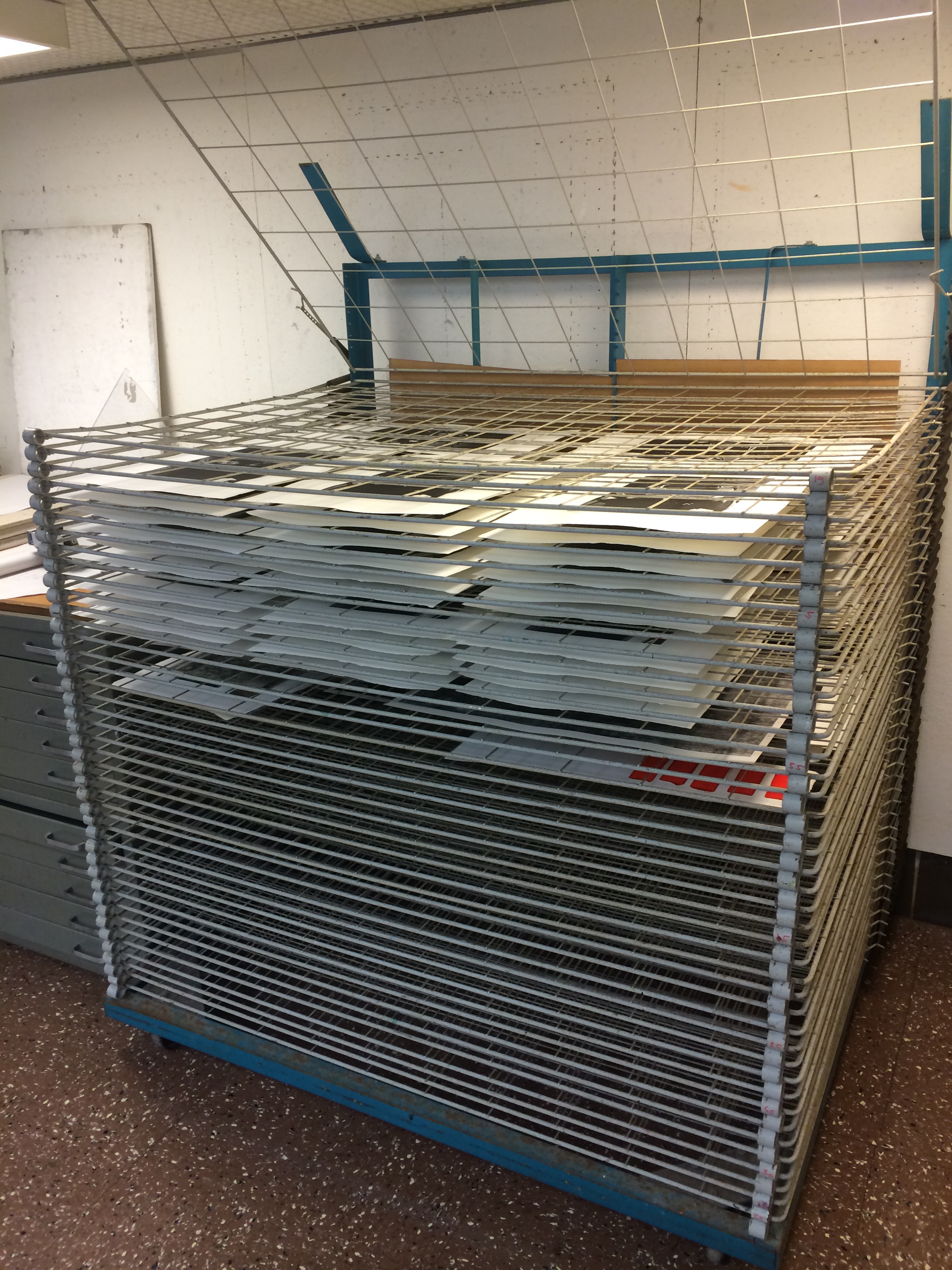
I bring you two more prints from the Intersecting Methods portfolio. Today, we reveal the editions of Heather Parrish and Andy Rubin. Click here for Heather’s bio post and click here for Andy’s.
Heather wrote this statement for her print.
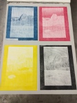
“Dystopic Solutions: Bio-remediation,” Inkjet print and Screenprint on Mylar, mounted to stonehenge paper, 14″x18″, 2016
The research interests of artist Heather Parrish and Dr. Elizabeth Hénaff intersect in a shared fascination with the mutually-creative relationship between inhabitant and environment. While this has taken them both down various investigative pathways, they chose to focus their collaboration on the Gowanus Canal – a stream-turned-industrial-waste-depository in Brooklyn, New York. With around 10 feet of toxic sludge resting on the bottom, the accumulated off-casts of decades of paint, pesticide and coal production (to name a few), it has been designated a ‘Superfund Site’ by the Environmental Protection Agency. As a simultaneously beloved and feared central artery of the Gowanus neighborhood, it is also the focus of Hénaff’s current research project. She is part of a team analyzing the microbiome that resides in the toxic sludge, discovering their metabolic functions and survival adaptations for this extreme environment. Finding organisms that work to break down the human-produced toxins, Hénaff hopes to foster their colonies and harness their evolved and natural remediating functions. Parrish spent one month in Brooklyn with Henaff exploring the many facets of the canal and Hénaff’s research. The image for this portfolio was a made with a hand-crank 35mm film movie-maker camera. The text is derived from a sampling of both the toxins and bio-remediating microorganisms found in the canal. This print is the genesis of an on-going, multi-modal, collaborative body of work centered on the Gowanus Canal.
-
- Dystopic Solutions: Bio-remediation by Heather Parrish and her collaborator, Elizabeth Henaff
-
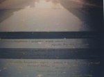
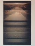
- Detail of Dystopic Solutions: Bio-remediation
Here is Andy’s statement.
“Xtal Omics Fractured Fairy Tales,” Lithograph, 18″x14″, 2016
Brian Fox is a professor/scientist in Fermentation and Biochemistry at the University of Wisconsin-Madison. Andy Rubin is a Master Printer and currently visiting assistant professor in Art at Indiana University in Bloomington. Our mutual concern, ( scientifically and artistically) has been the human environmental impact/damage from climate change and our consuming need for , and use of, fossil fuels.
Brian’s research delves into the nature and structure of proteins. His main research is probing the active residuals of protein substrates and how it interfaces with the oxidation of hydrocarbons. This research breaks down proteins and investigates what they eat, how they grow, and how they can be manipulated to achieve a positive solution to a ongoing problem with our planets environmental dilemma.
In going through visualizations of this process, I had the idea of stacking the images he sent me into a human form ( the enzymic snowman) to illustrate the dilemma of how we look at (environmental )information . This figure then examines the world of natural science (the pile of Rocks) to look for clues in how to understand its elements. This starts the scientific inquisition/research needed to solve the problems created by our unquenched desire to pollute and destroy the planet for profit.
The third panel is a mis-representation of the “Golden Mean”. This symbol of Universal perfection is included to remind us all that inquisition into the nature of science, starts with a pre-possessed image of how we understand the world. Science , like art, builds upon a culmination of knowledge and information. Whether this information is right or wrong depends on circumstances and time.
Brian’s research may indeed , one-day, change the world. The break down of the proteins he is studying may develop a petroleum eating enzyme that can clean the oceans of oil-slicks. In illustrating this potential (of “humankind’s“ questioning and inquisitive nature through science), Brian and I have created an image where science steps back and reflects on what is needed to solve the problems facing our world today.
-

- Xtal Omics Fractured Fairy Tales by Andy Rubin and his collaborator, Brian Fox
-

- Detail of Xtal Omics Fractured Fairy Tales
Check back in a week for another set of prints from the Intersecting Methods 2016 biennial portfolio.